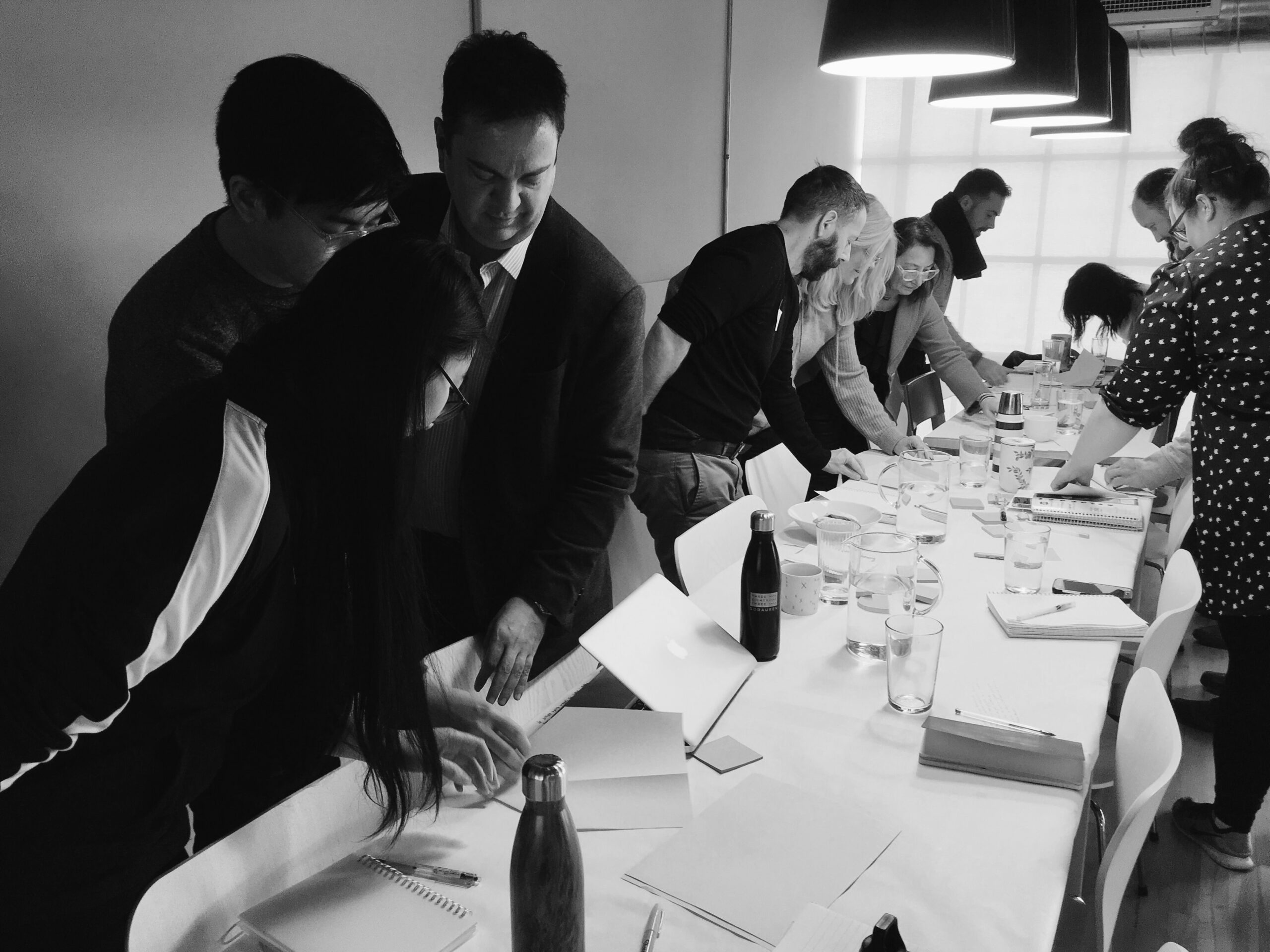
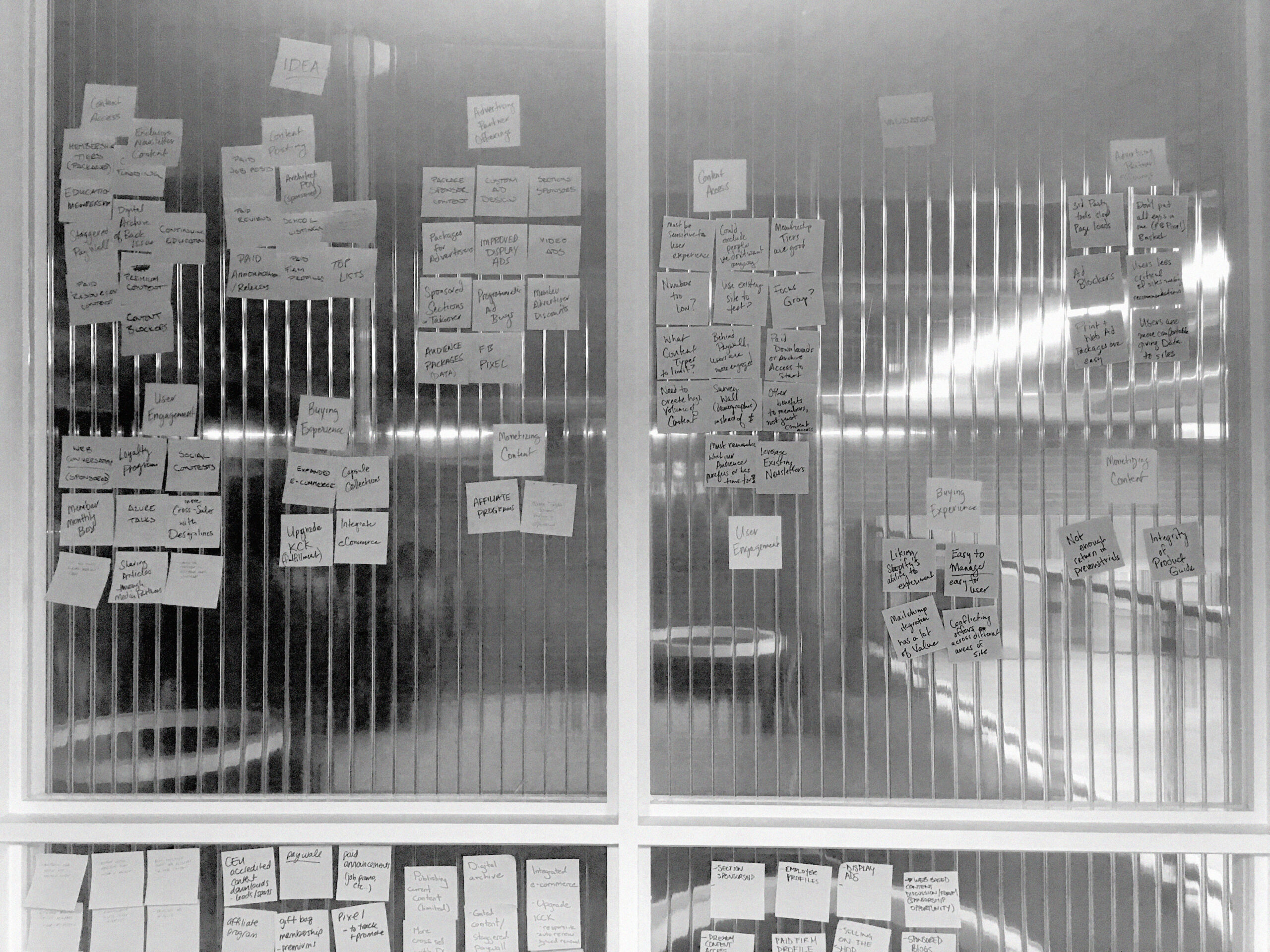
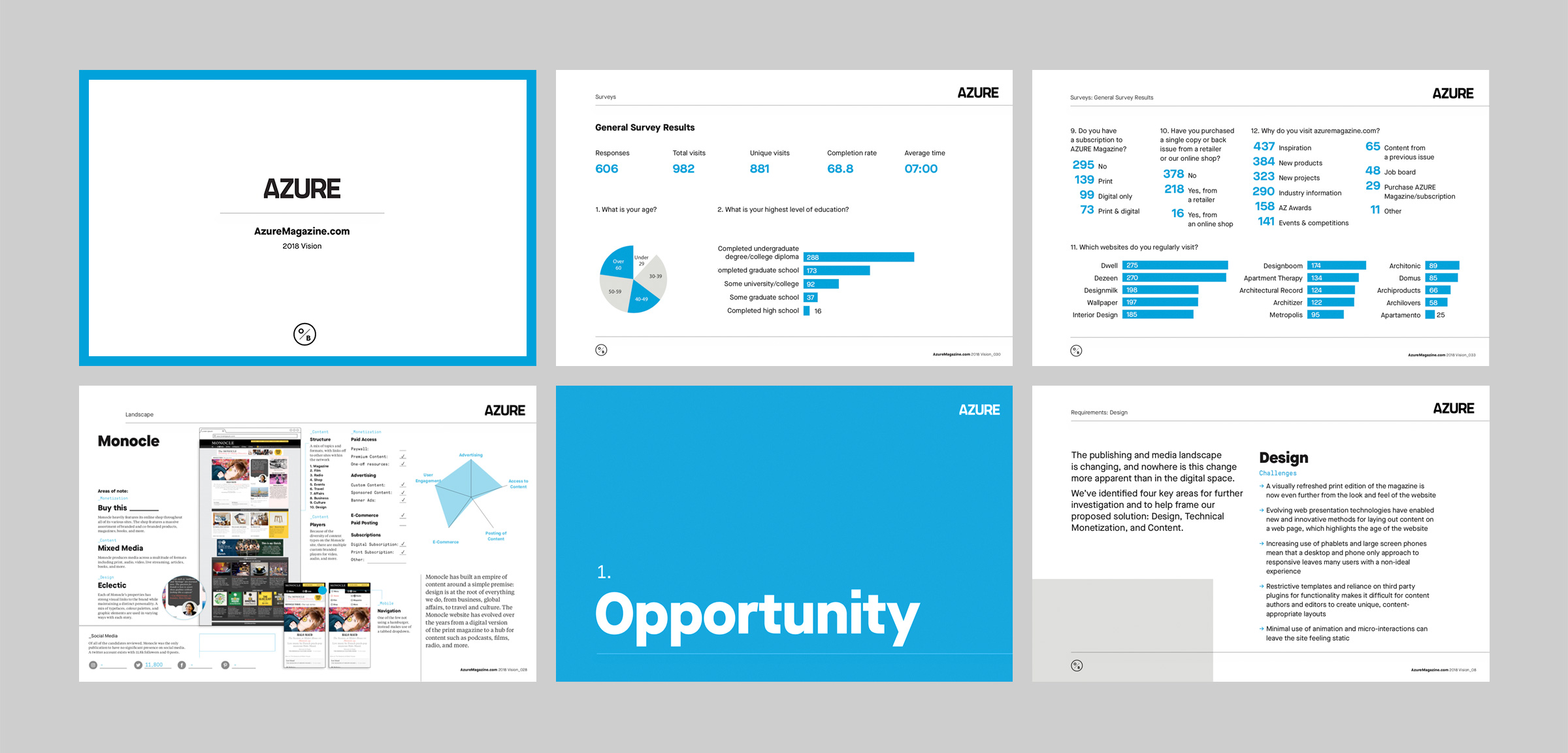
Creating this new edition of the website was a collaborative effort right from the start. Significant Other started by hosting workshops with AZURE’s entire team to gain a clearer understanding of each department’s needs and uncover new ways the site could work better for them. We also conducted reader and advertiser surveys to help better understand how the site could deliver stories, inspiration and sponsored content in a richer, more engaging way. This holistic approach really helped us make decisions based on real, tangible benefits and avoid change for the sake of change.
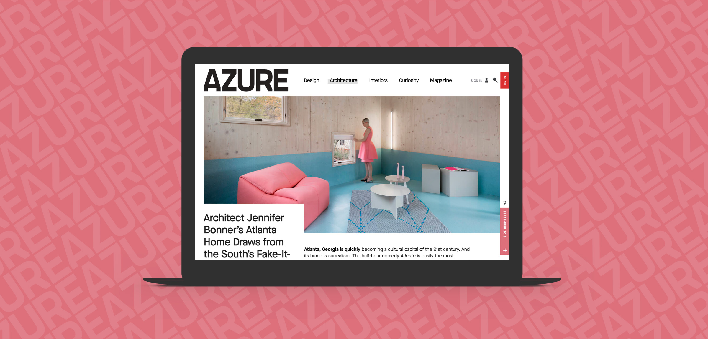
The all new azuremagazine.com
For decades Azure has brought future forward design to the page and screen, so in redesigning their website, it was important to us to honour that tradition.
Built from the ground up using the next generation of front and back end technologies, the new site is all about creating a platform on which AZURE can better engage with their audience, both now and in the future.
- Services
- UX & UI Strategy, Website Design, Website Development
- Website
- azuremagazine.com
Our Collaborative Approach
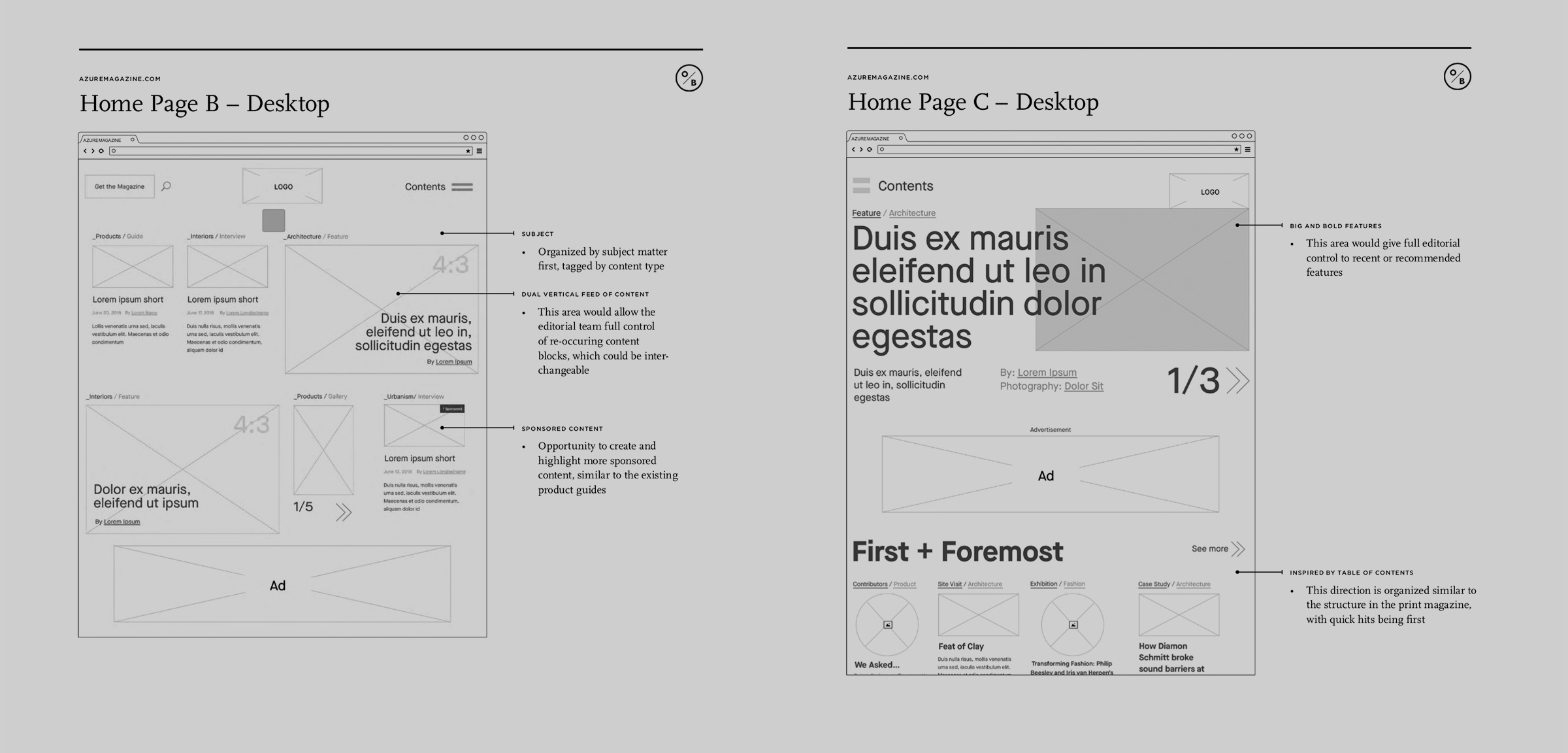
Enabling Discovery
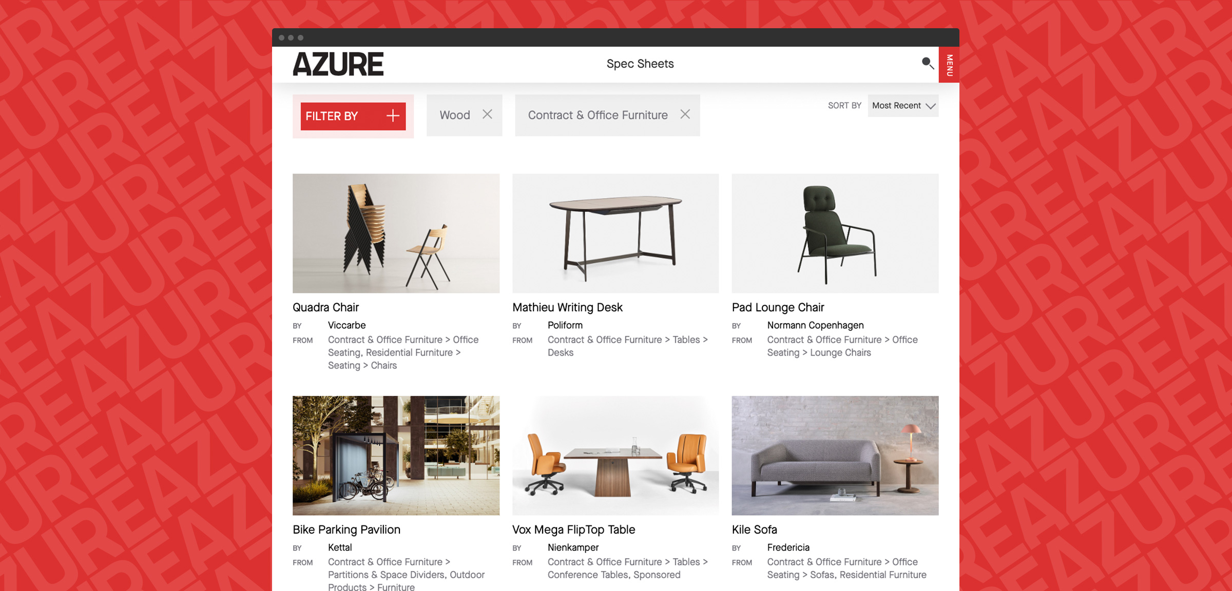
Azure is about so much more than beautiful photography and world class design–it’s a valuable tool for design professionals to discover new products, materials, and ideas. With this in mind the Spec Sheets section saw months of design exploration and development, ensuring that it could enable professionals to find exactly what they were looking for while also giving the editorial team tools to build stories around unique products, people, and processes.
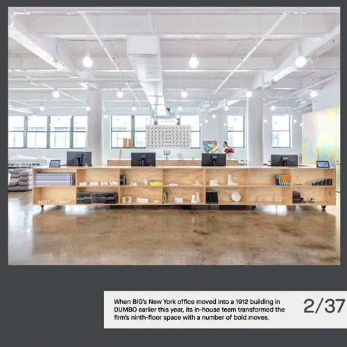
In addition to high utility areas like Spec Sheets, we also wanted to create moments of surprise and discovery for users, so we spent weeks prototyping the article proposition block at the end of each post, ensuring that it doesn’t just serve up related article recommendations, but instead allows users to “choose their own adventure” as they scroll seamlessly from one story to the next.
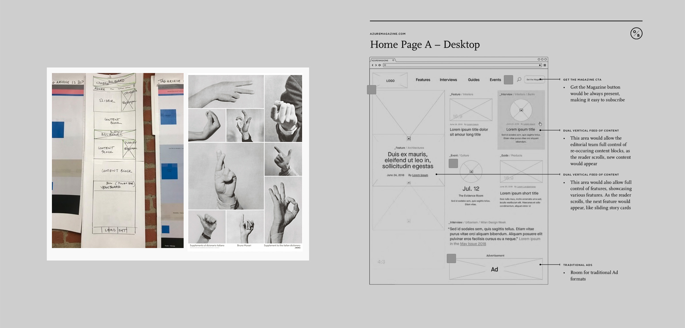
A big part of the early inspiration was creating a sense of visual depth through motion and intuitive gestures, rather than relying on lines, gradients and drop shadows. Our aim was to establish a visual language that felt very much in line with the recent redesign of the print magazine, while also creating a unique online experience that stands on its own. In the end, we created a flexible layout that allows the editorial team to tell stories with big, bold imagery, interactive call-outs, pull-quotes, and new post formats such as feature articles and scrolling image galleries.
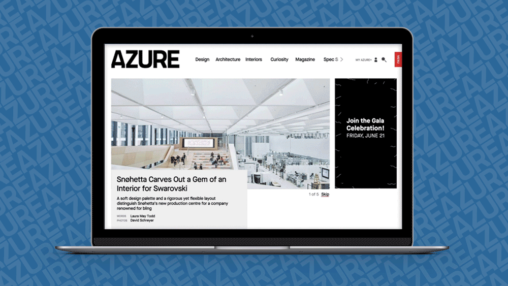
Fluid, bold, dynamic, and visually immersive. The re-imagined Azure website offers an all-new experience that presents our editorial voice and carefully curated selection in a much-enhanced format.
– The Azure Team
Like what you see? Let’s build something great together.
Let's Talk
Copyright © 2026 § EST 2013
YYZ YWG ITA IRL & BEYOND