Stirring Up a Bold New Visual Identity
Select Food Products
For over 80 years, Select Food Products has been producing the best cooked and cold-mixed sauces, salad dressings, condiments, and more. Offering high quality, innovative products in the co-manufacture, retail private label, foodservice and industrial segments across Canada and globally, chances are you’ve enjoyed a delicious sauce or condiment that came from Select Food Products.
Recently under new leadership, Select’s manufacturing processes, equipment and production lines, streamlined portfolio, and heightened emphasis on quality and safety have been transformed and have enabled new levels of quality, scale, speed and agility. To mark this new chapter, Select Food Products approached Office/Bureau to create a fresh visual identity, designed to convey a bold future, full of innovation and growth.
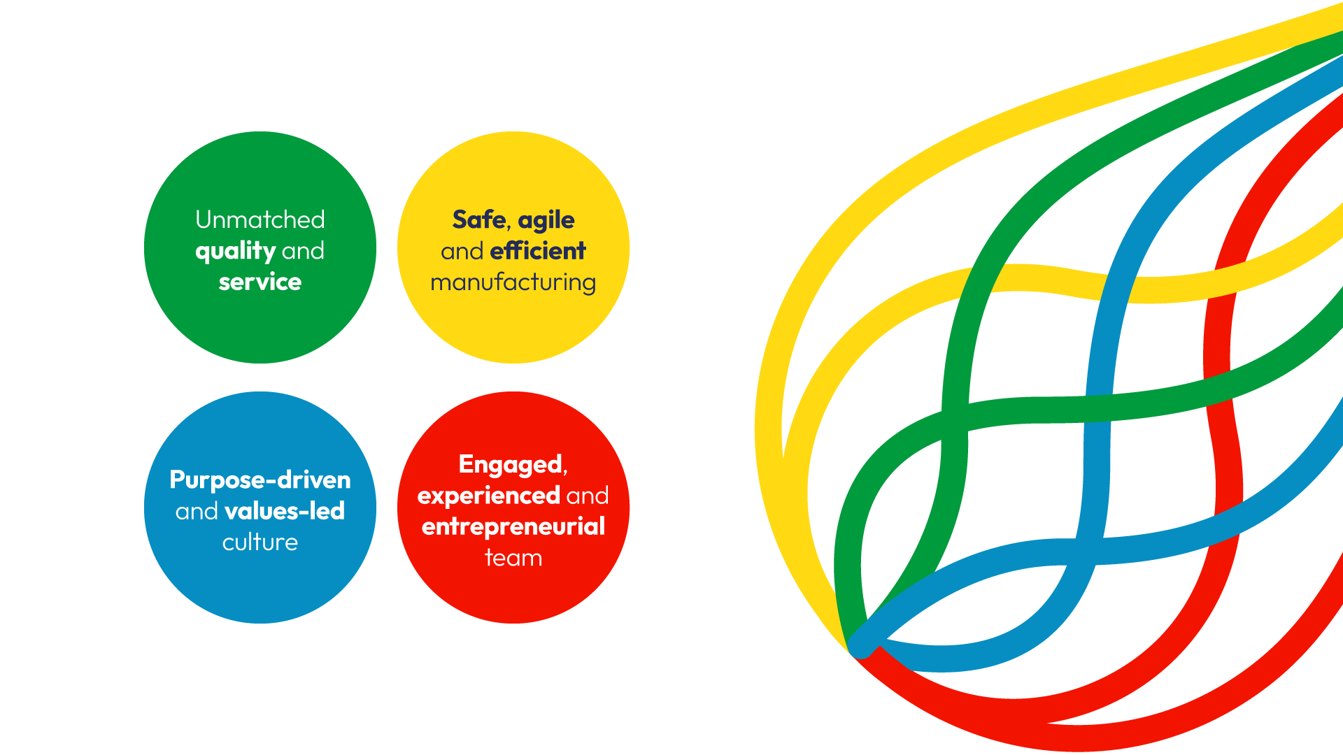
At the centre of the new identity is “the whisk”, which is essential for the perfect blend of flavours and textures in sauces. Each bold colour of the whisk’s tines signifies one of Select’s key attributes, intertwining to form a single line representing their purpose: To Make the Best Sauces for the World’s Best Brands.
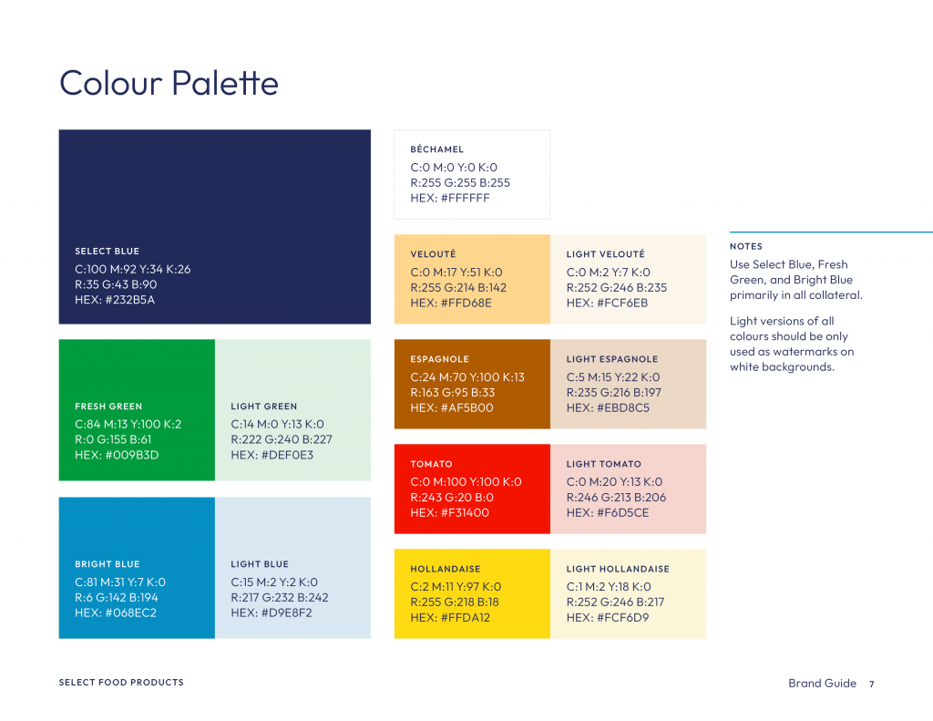
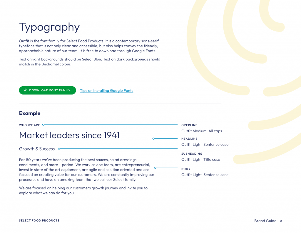
The fresh new colour palette was inspired by the “Mother Sauces” in French cuisine, which serve as the base for a variety of delicious sauces. The green and bright blue were chosen to bring more freshness into the palette, while the main Select blue was carried over from the previous identity to maintain consistency and brand recognition. The new contemporary sans-serif typeface was chosen as it is not only clear and accessible, but it also helped to convey the friendly, approachable nature of the Select team.
As a secondary element in the visual identity, Office/Bureau created a set of universal symbols that represent the various stages in Select’s manufacturing process and their commitment to innovation. To compliment these symbols, a second set of icons was created to represent Select’s guiding principles as a company. They are used when speaking about their team, their company culture, and what they believe in.
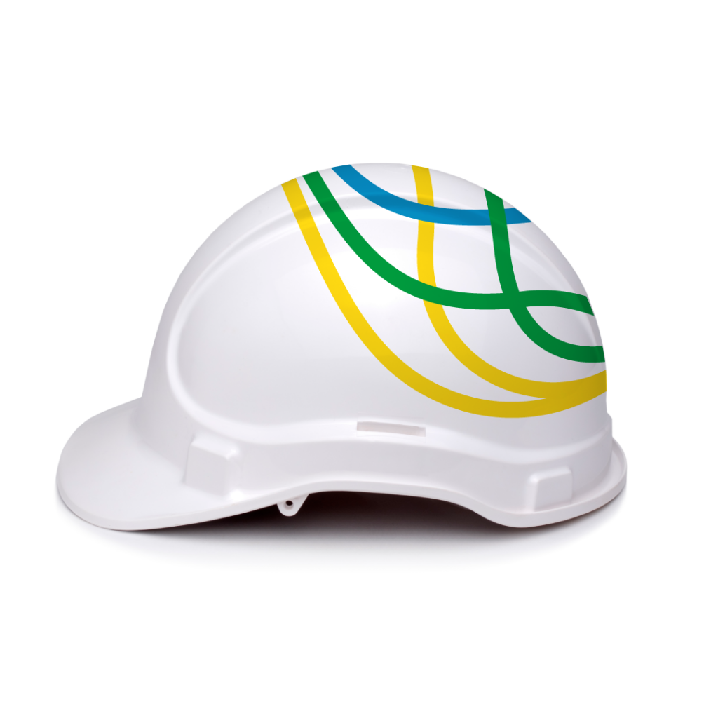
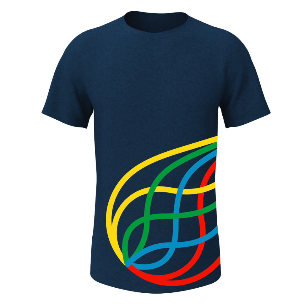
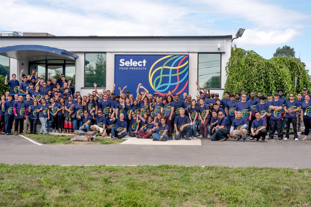
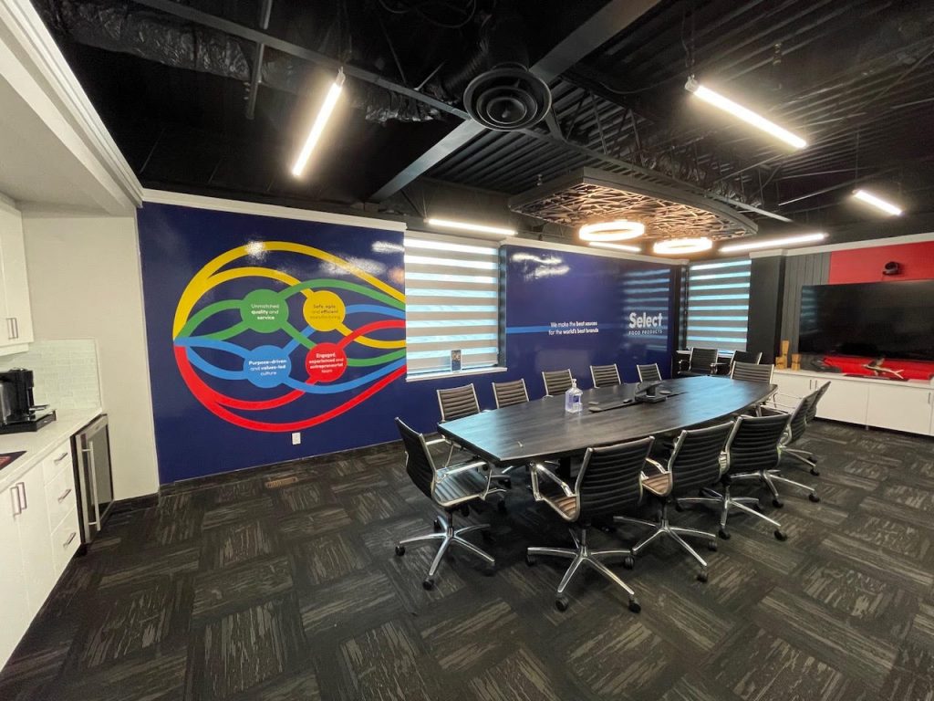
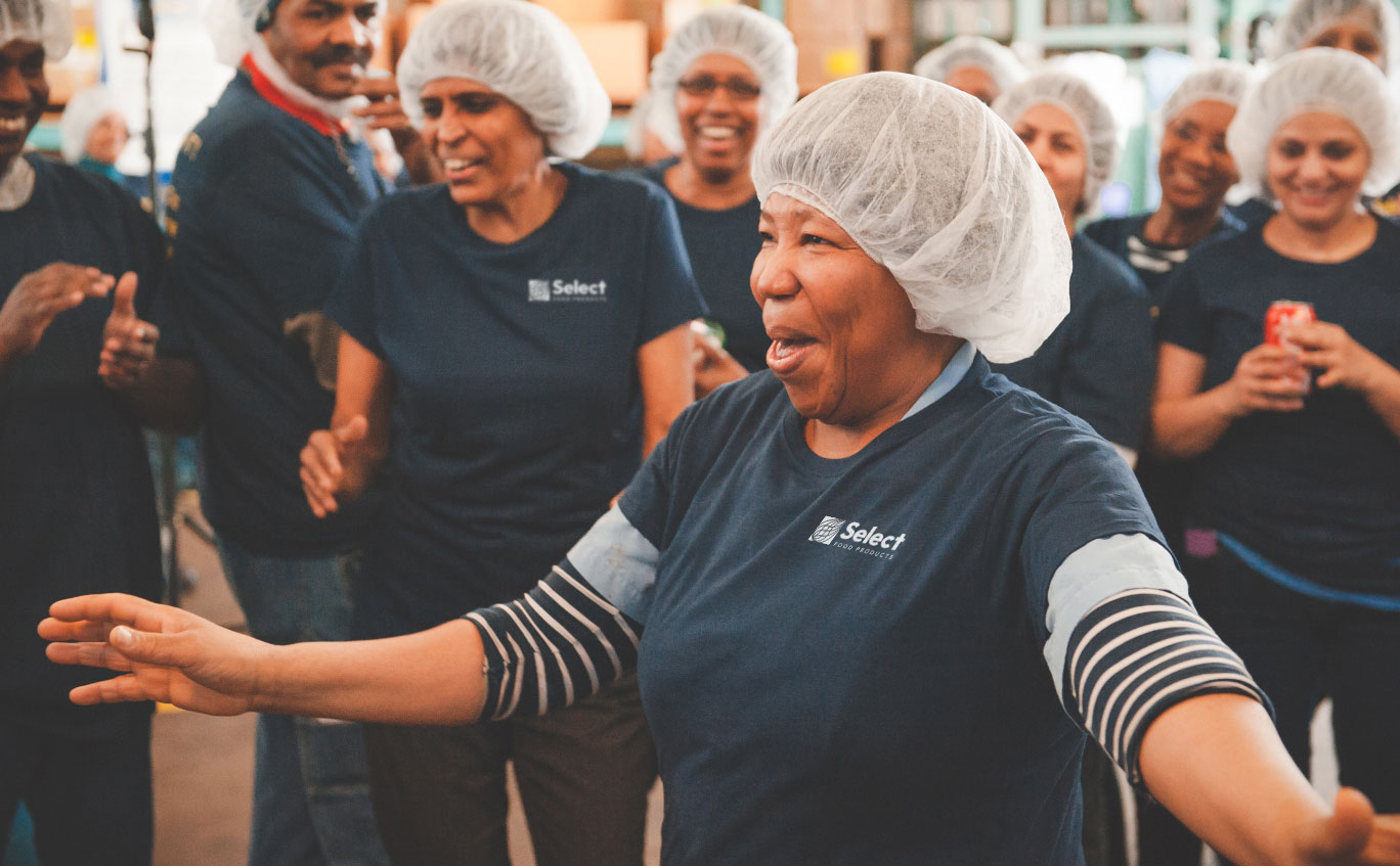
The design process led up to a brand launch event which showcased the culmination of the new brand assets. These included a new exterior sign, team t-shirts, boardroom environmental graphics, a powerpoint sales deck, and a video that introduced the refreshed identity. The launch event led to media coverage of the new chapter in Select’s growth as a company and continued progression in the modern world.