The Future of Ontario’s Forests
Ontario Professional Foresters Association
Ensuring the highest professional standards of practice in forestry in Ontario for over 60 years, the Ontario Professional Foresters Association are champions of sustainable forest management practices, and caring for our most valuable renewable resource for generations to come.
As part of this rebrand, our task was to not only convey the storied history of the organization, but also to appeal to future generations of forest professionals by promoting continued education and technological advancement, and informing the public about the role professional foresters play in our economic and ecological survival.

During our discovery process, we conducted research on the forestry sector, the organization, and their membership. This included:
- An analysis of peer organizations to determine best practices, and identify opportunities for differentiation and innovation
- An in-depth audit of the existing website and all existing communication materials
- Surveys and interviews in which we gathered insights and opinions about how members see the OPFA and what they could be doing better
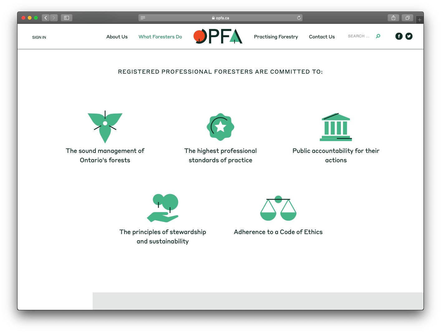
One of the things our research confirmed is that many Ontarians have an outdated notion of the role foresters play in the long-term health of our forests and economy. We address these misconceptions by highlighting Ontario’s sustainable forestry practices, the technological advancements in forestry, and the role forestry plays in urban environments.

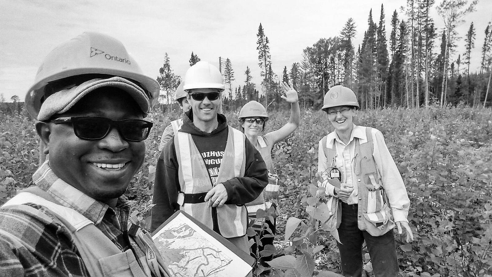
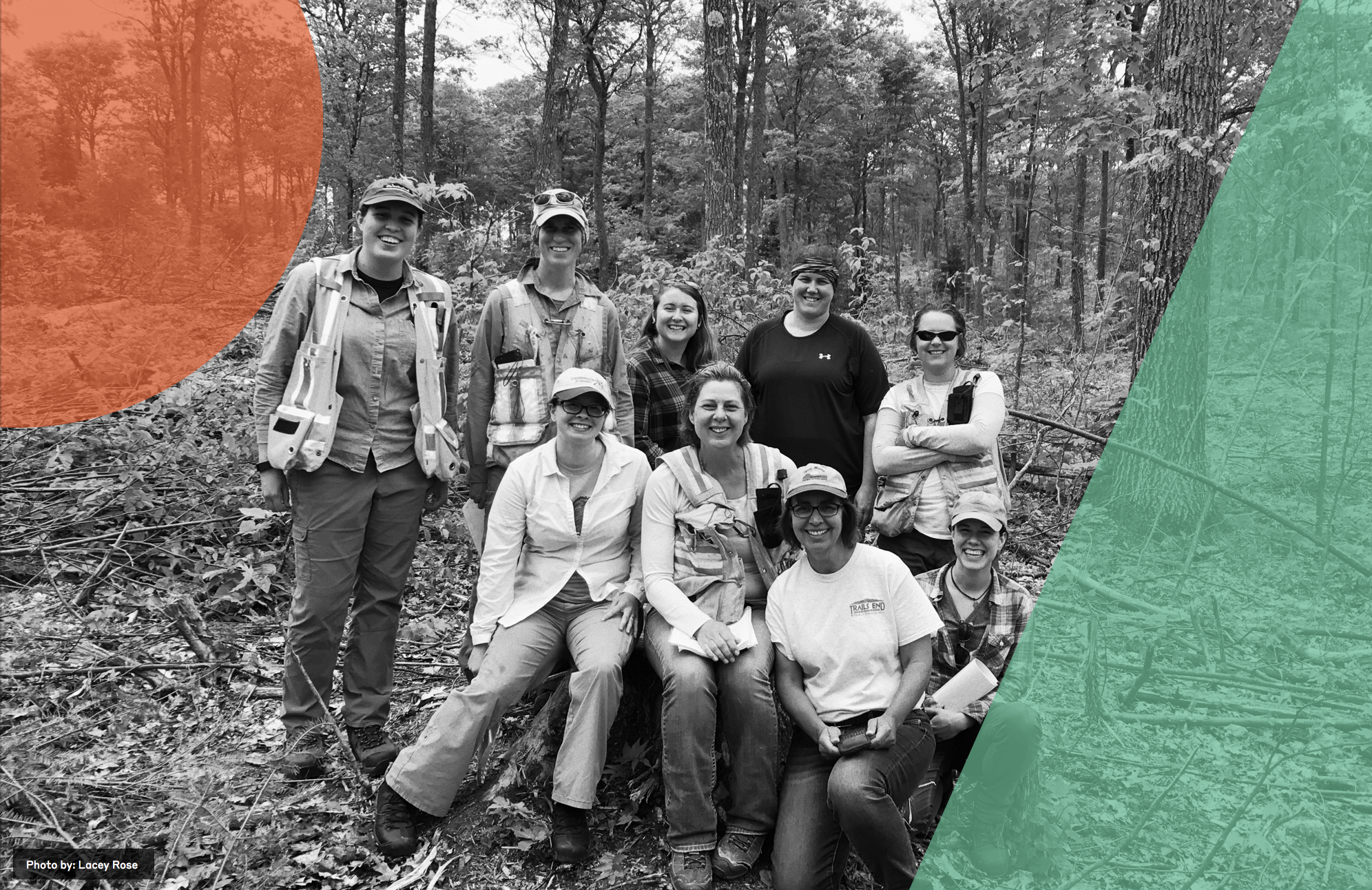
Another insight uncovered by this research was a general lack of representation of the people behind forestry in Ontario. Our rebrand aims to remedy that by highlighting the diverse faces and communities that support and are supported by forests in Ontario using original, member-sourced photography.
Perhaps most importantly, our research supported the need for a brand identity that is modern, professional, and progressive, and is worthy of the reputation the OPFA has built over the last 60 years.
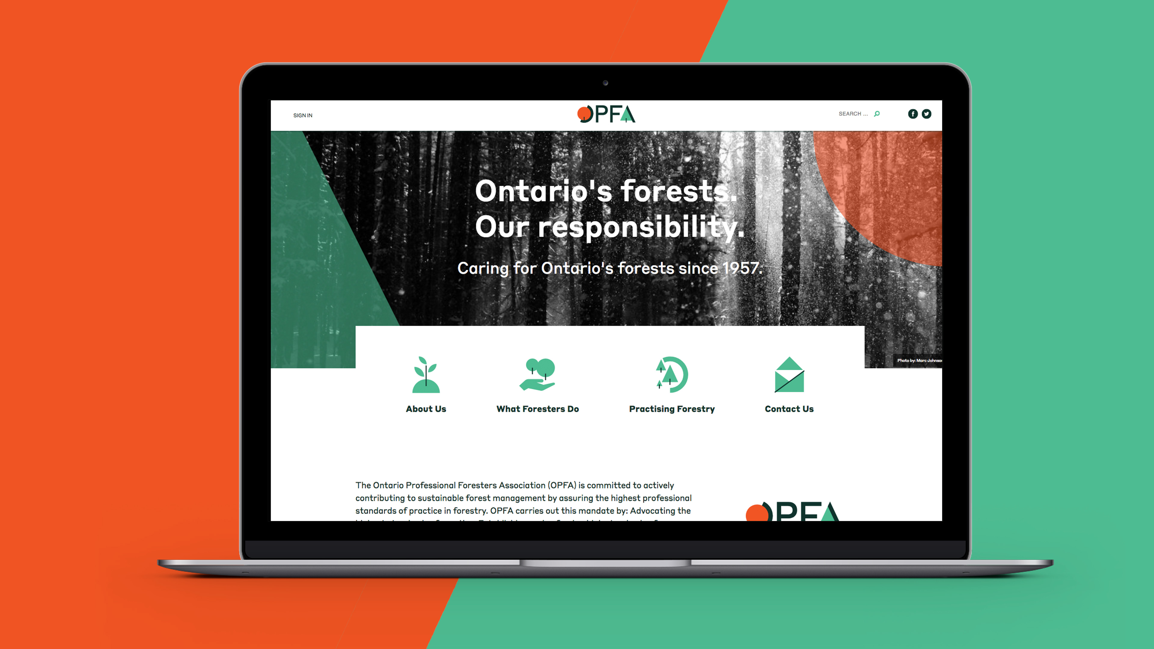
The new brand identity grew out of exploring the shapes and colours of trees native to Ontario. The “O” is represented by a simplified deciduous tree, and the “A” a coniferous tree. The light teal represents the fresh new growth of spring saplings, while the red-orange represents the incomparable autumn colours we enjoy in Ontario. Both of those are complimented by a deep green representing old growth forests and our rich history of forestry.

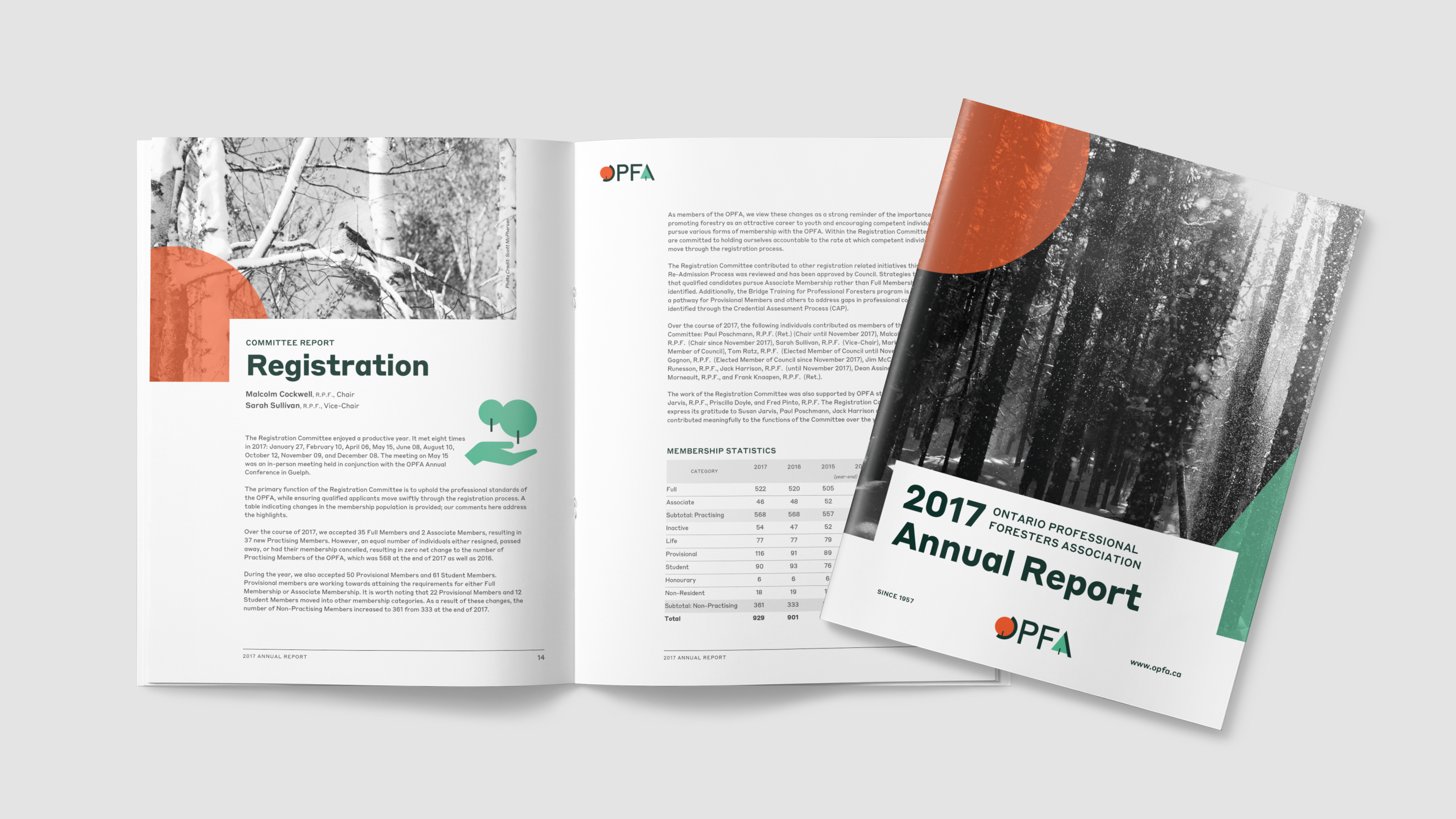
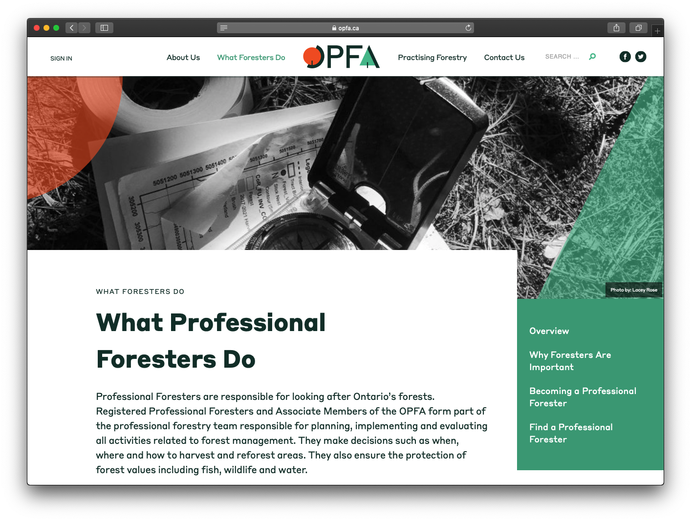
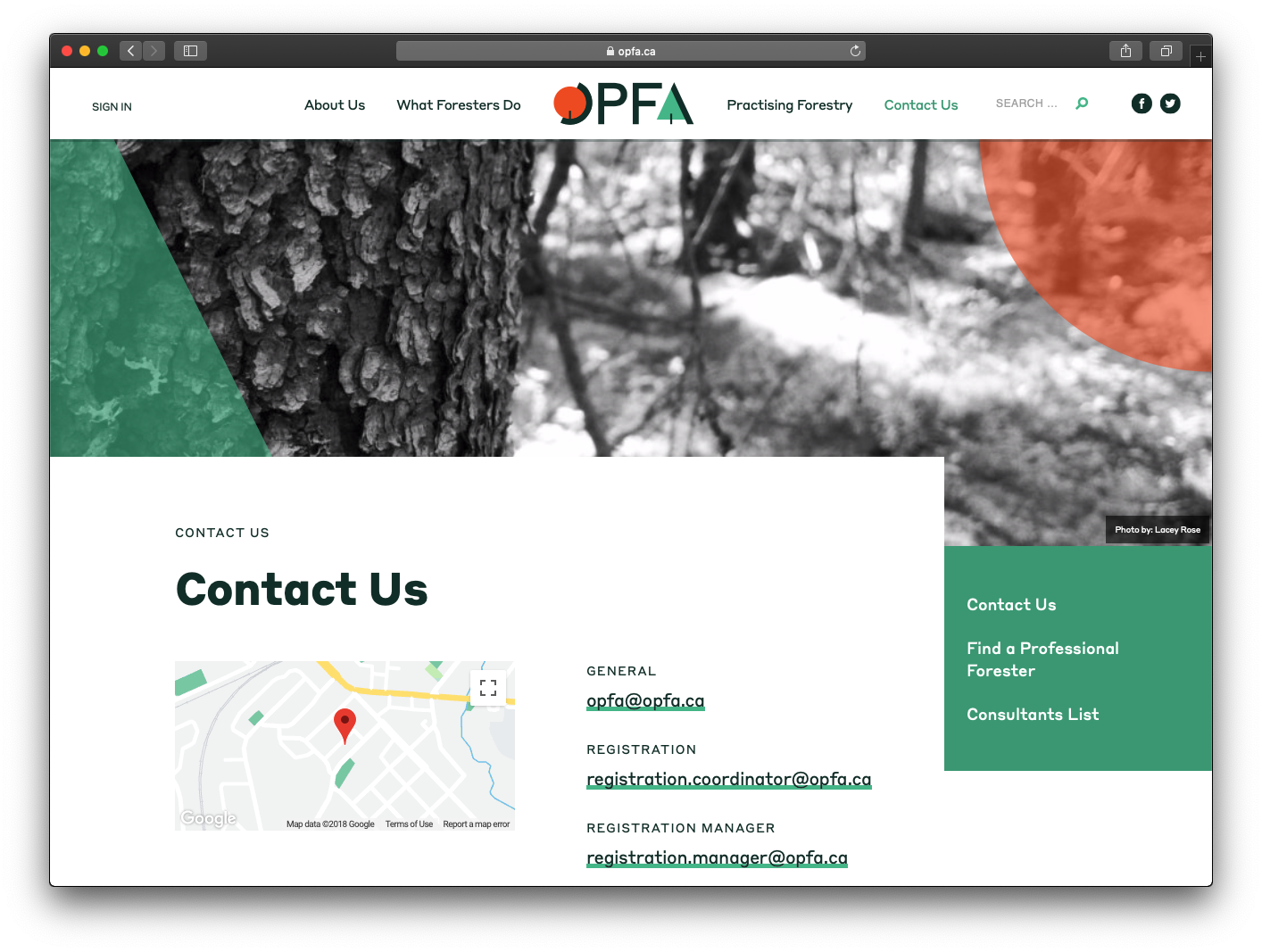
As part of the rollout of this refreshed brand, we also launched a new website and membership hub. The website features bold photography and engaging layouts, with subtle animations to bring every page to life. The site is fully responsive, with a focus on usability, accessibility, and performance driven by the diverse membership.