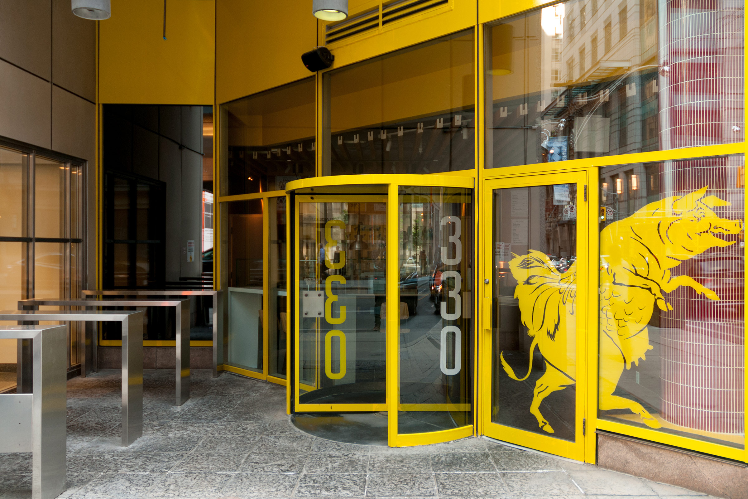
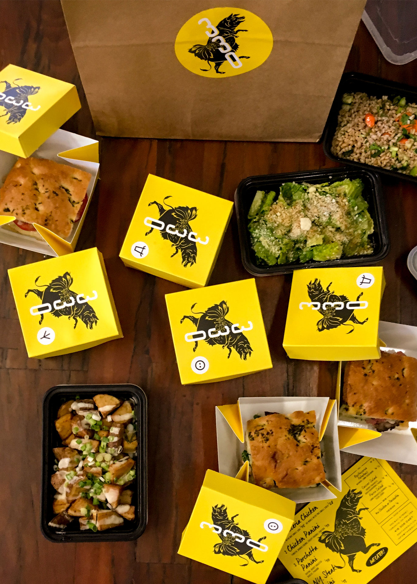
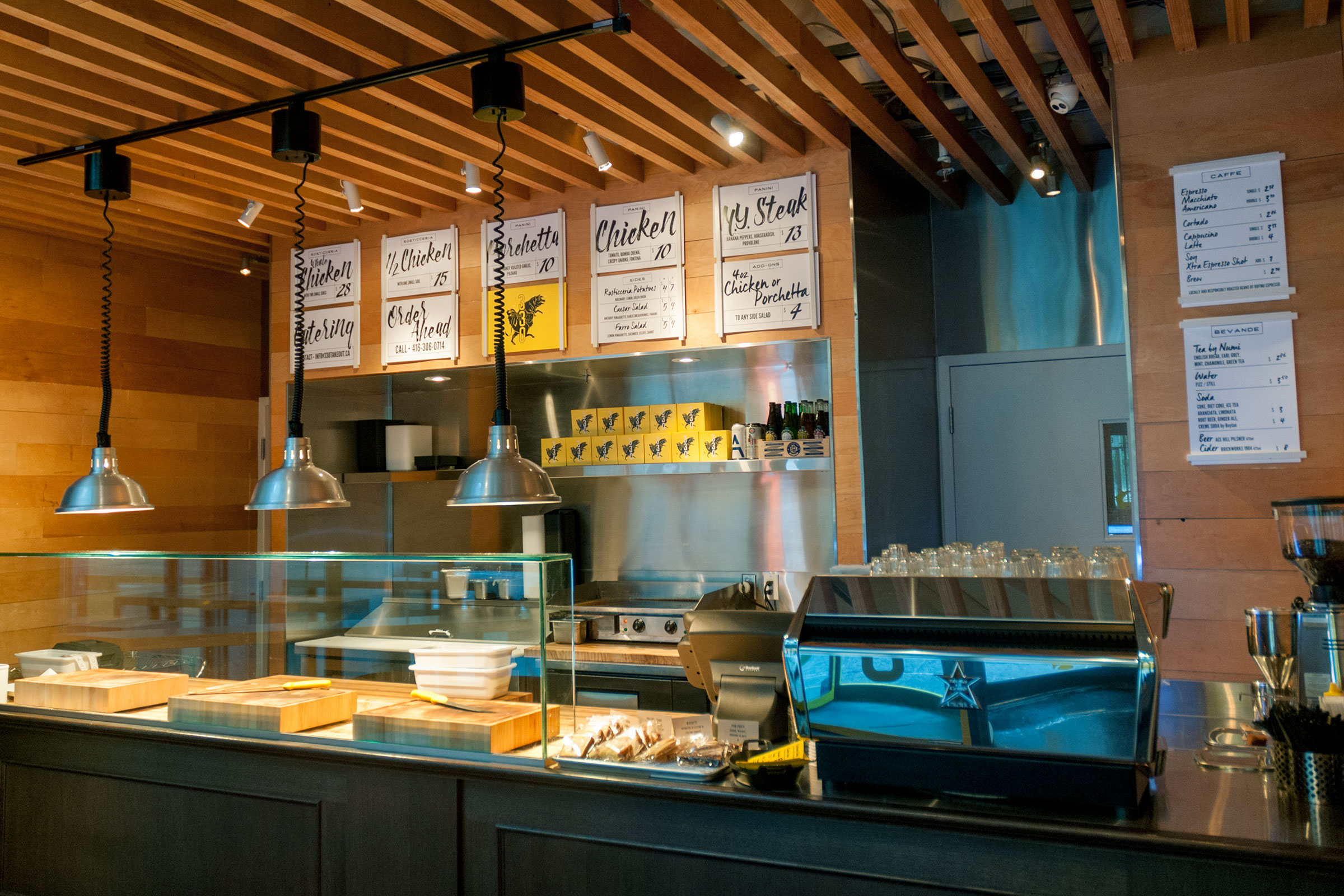
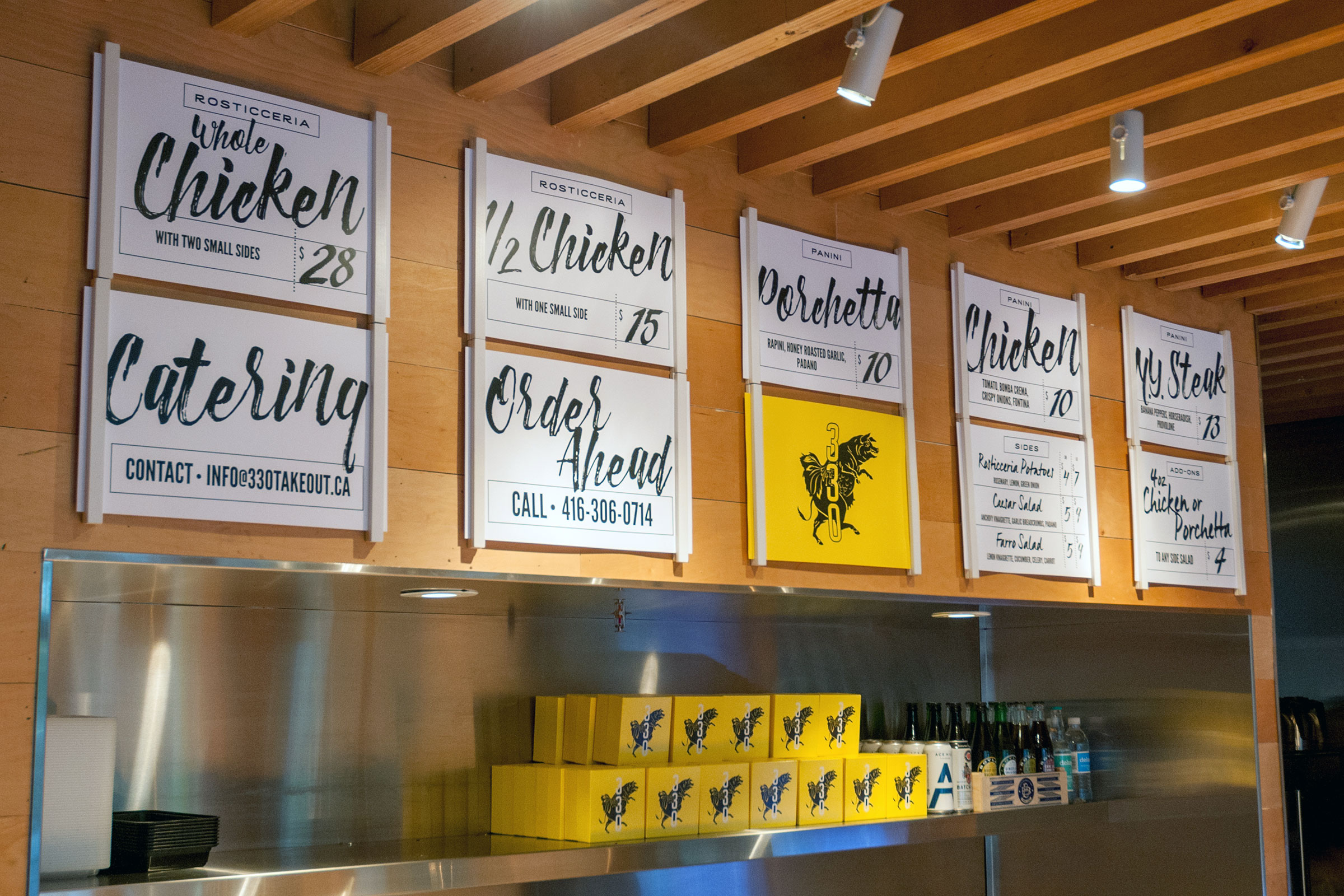
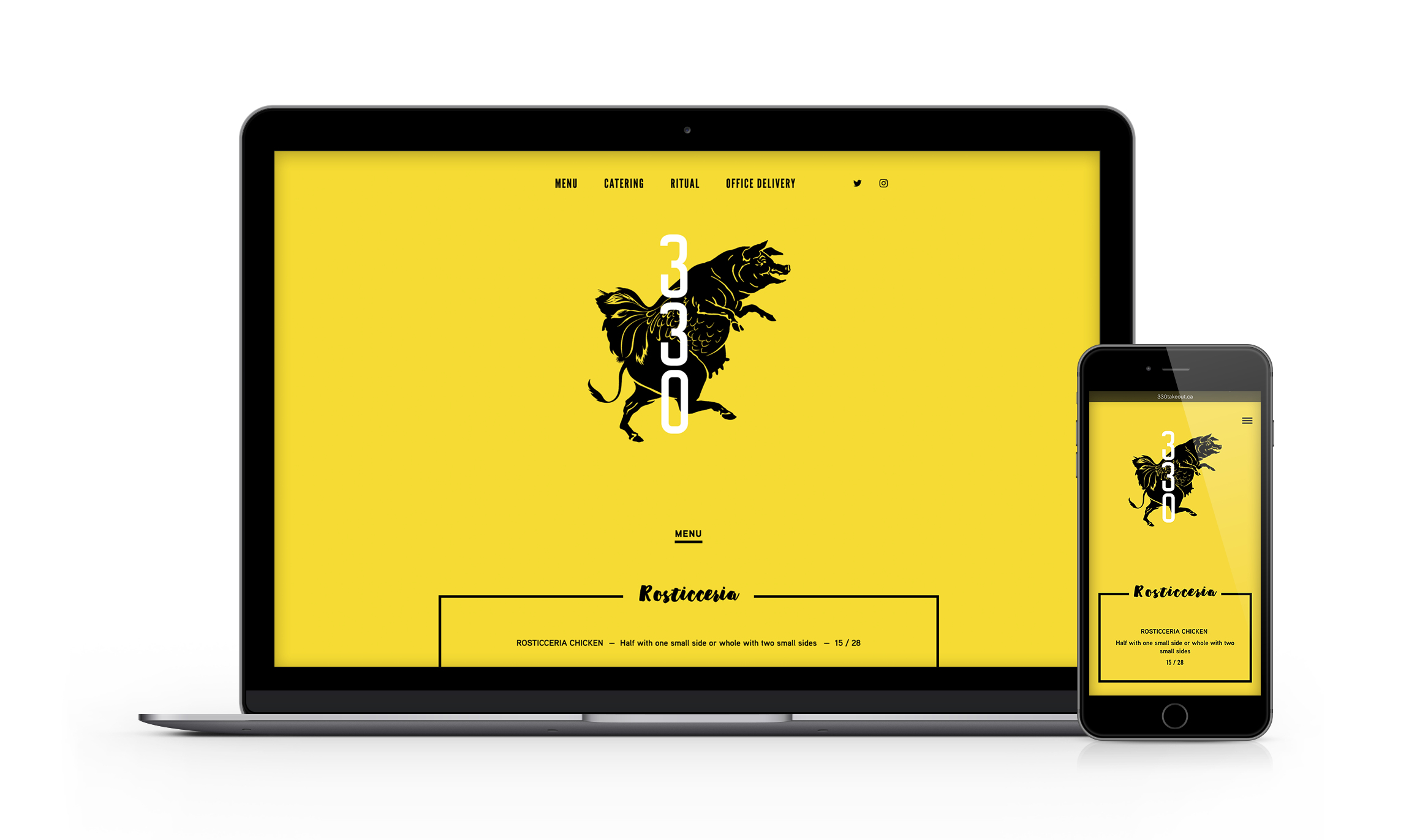
We wanted something fun and a little unexpected, modern but rooted in an older visual tradition. The 330 logo takes its cue from a 19th century nursery rhyme illustration: a wily chimera, part pig, part chicken, part cow, announcing exactly what’s on offer without saying a word. Rendered in black and yellow with a mix of authentic brush scripts and gothic, utilitarian typefaces, the identity echoes handwritten price tags and painted signs in old butcher shop windows. It carried through everything: a hard-to-miss exterior, interior signage, take-home menus, and the detail that quietly became the brand’s best ambassador. The bright yellow sandwich box, marked with custom pictograms for each of the three meats, started showing up on streetcars and in offices across the neighbourhood almost immediately after opening.

Three Meats, One Beast

Mercatto’s original location at 330 Bay Street had spent years becoming a fixture for the power brokers and investment bankers who fill those blocks at midday—a reliable, well-loved Italian lunch spot in a neighbourhood that had since filled up with reliable, well-loved Italian lunch spots. Mercatto knew their clientele well, and they knew it was time to offer them something different.
The concept was sharp: three slow-roasted meats, rotisserie chicken, New York strip, and porchetta, served on paninis in a casual, butcher-inspired space. No pasta, no pizza. Just focused, confident cooking with the kind of provenance the Financial District crowd could appreciate. Our job was to build an identity around it that felt as bold as the pivot itself.
- Services
- Brand Strategy, Packaging, Print, Visual Identity

If this work resonates, imagine what we could create together. Let’s talk about it.
Let's Talk
